World Out of Home Organization
The World Out of Home Organization is a global Out of Home Association that works to promote and improve the OOH industry on behalf of its members. Formerly known as FEPE International, our role was to re-name the organisation and provide clarity to its purpose.
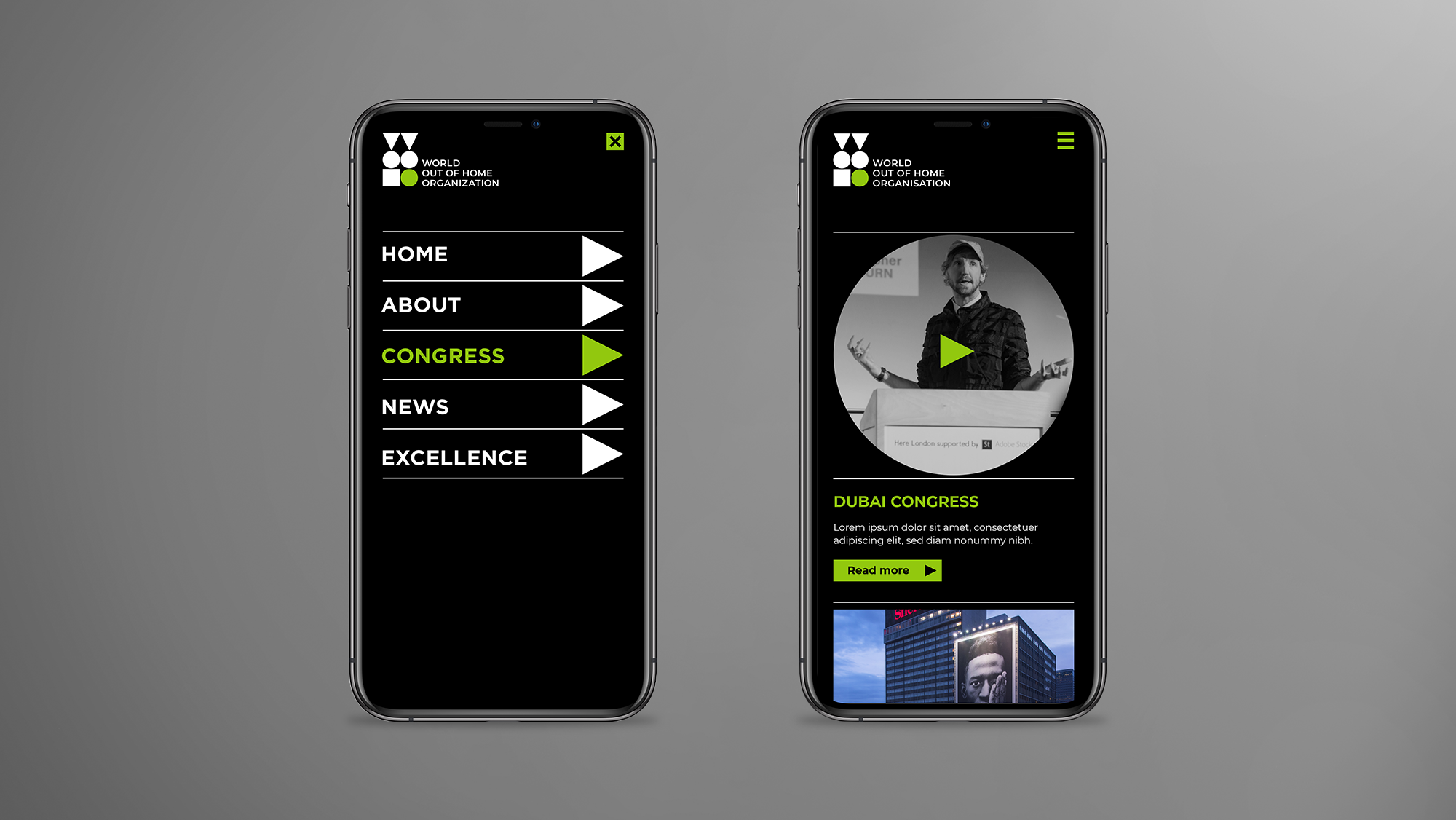
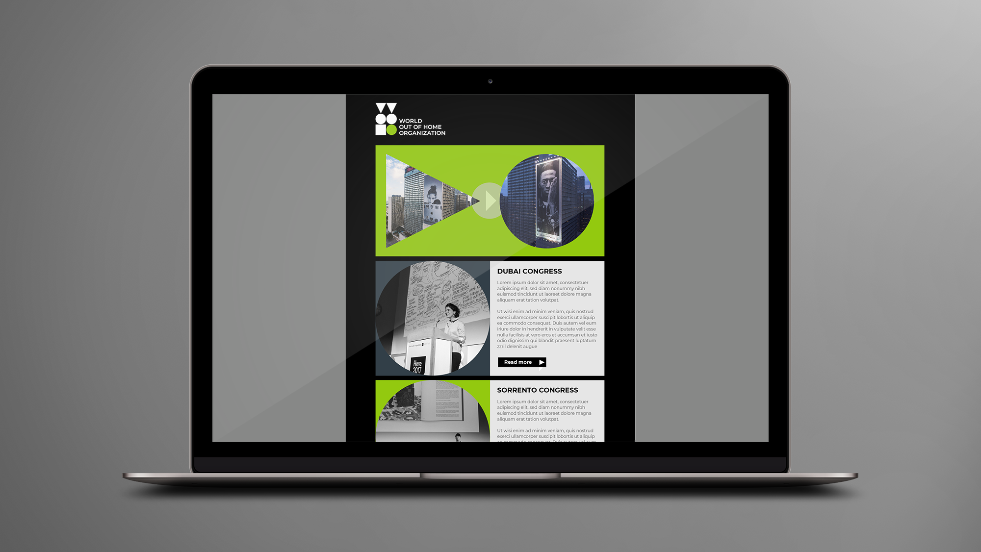
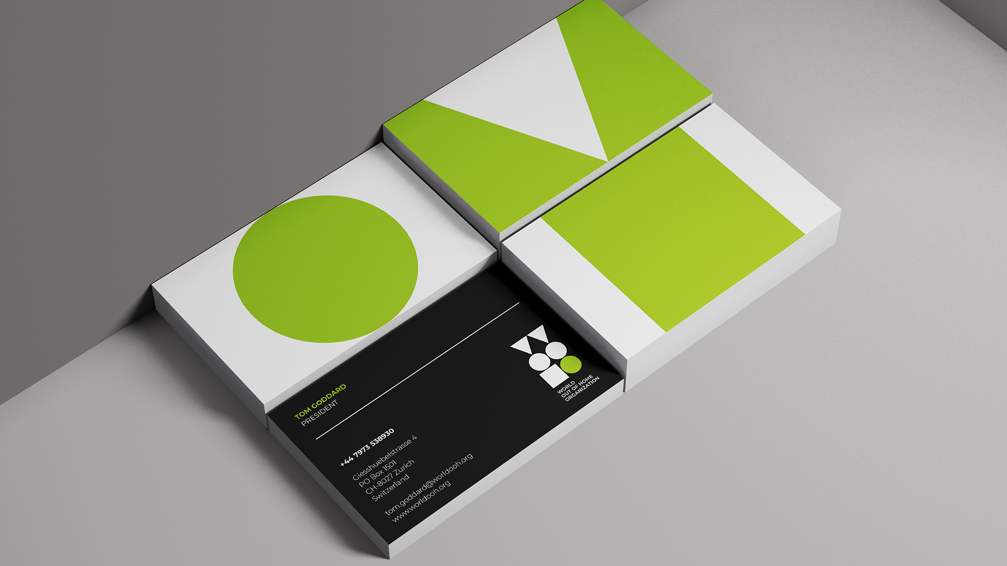
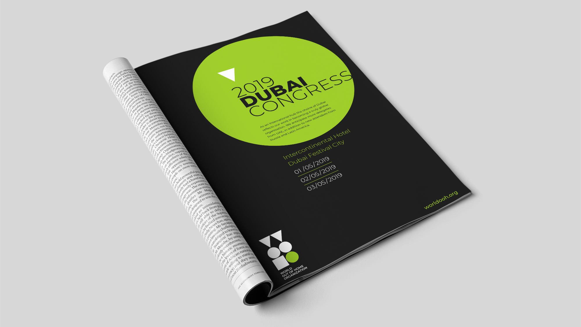
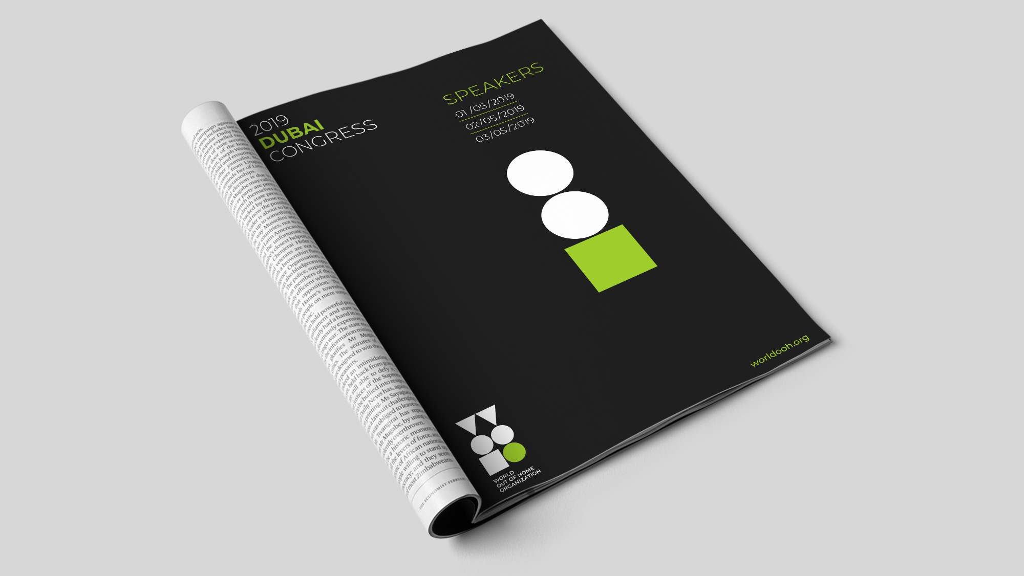
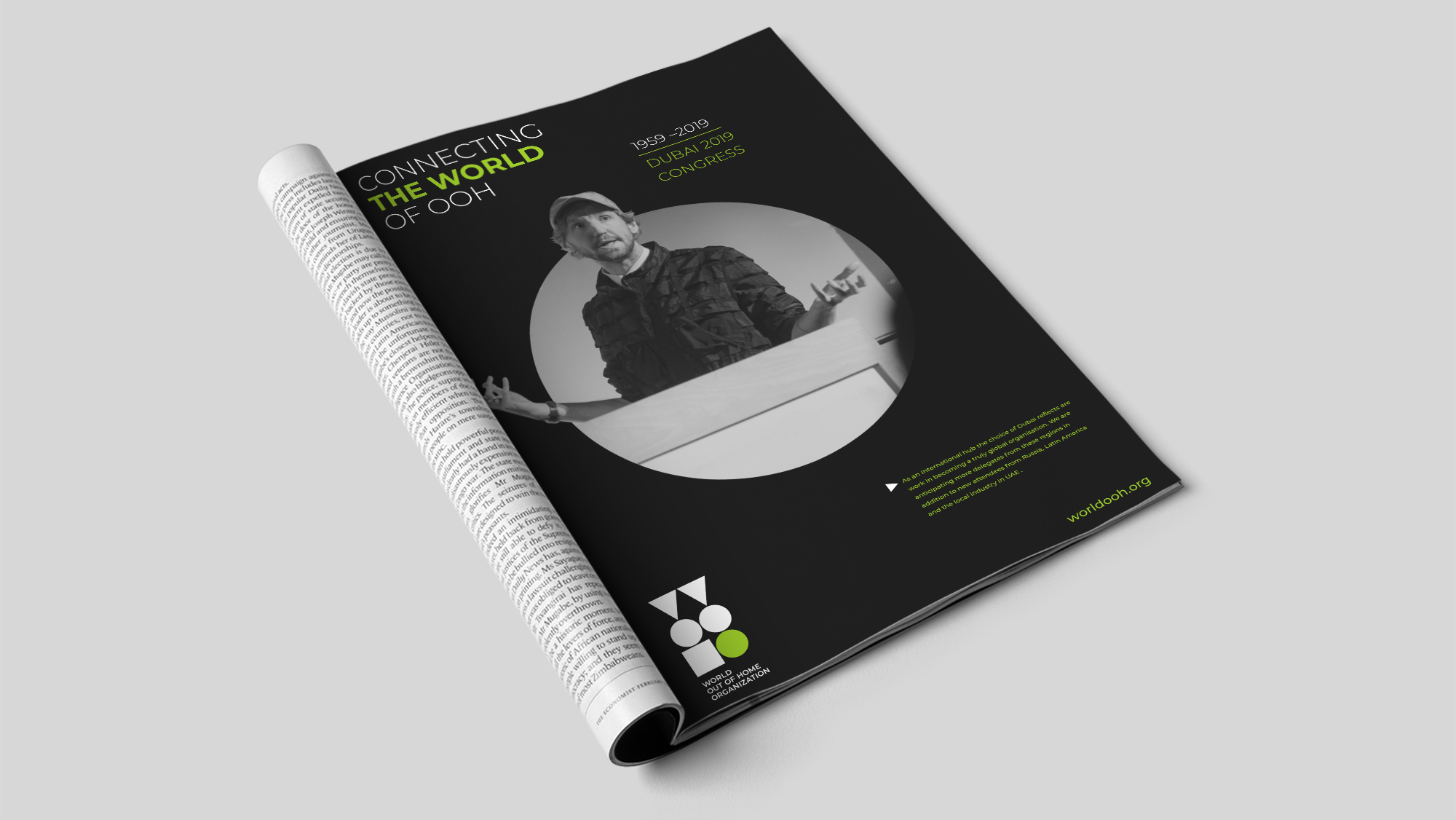
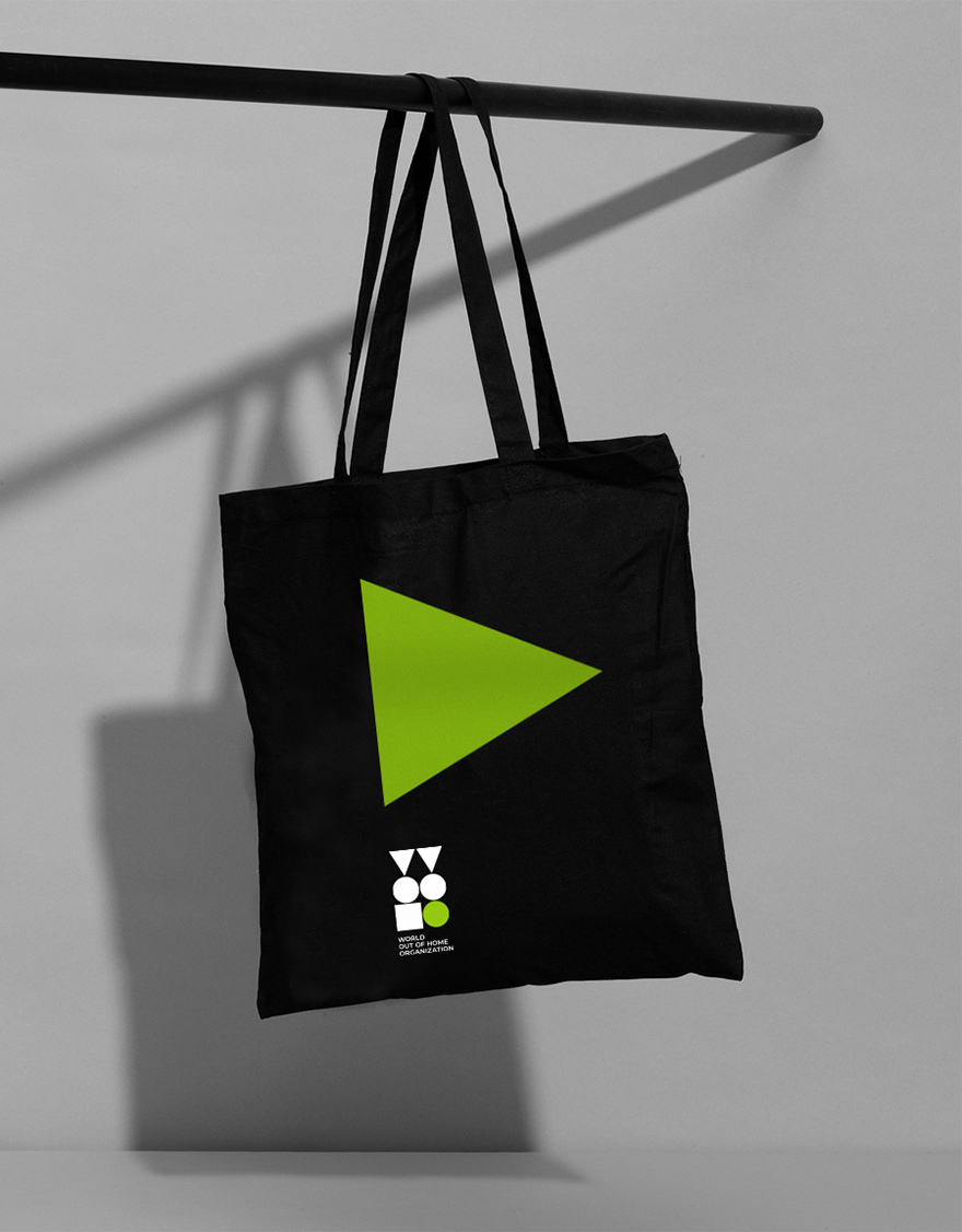
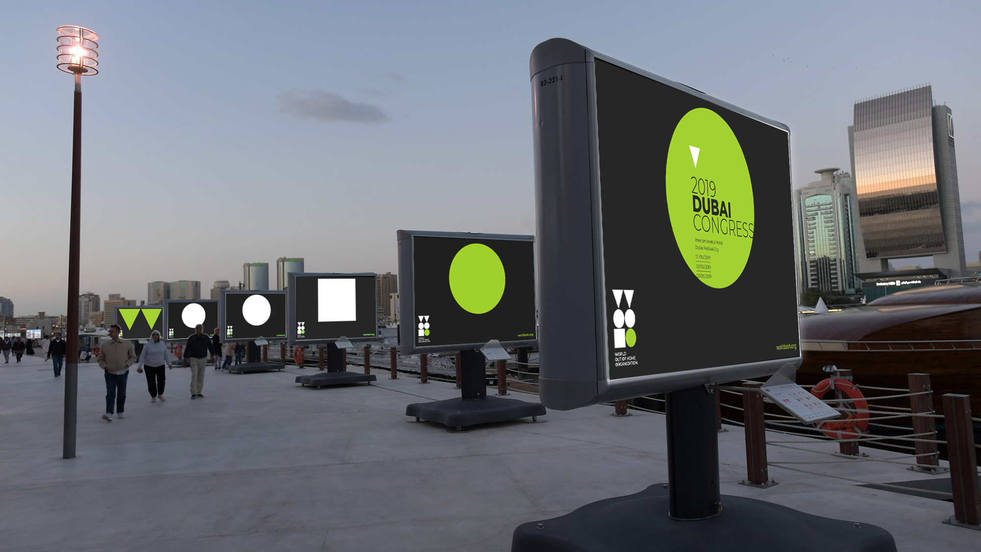
For the organisation's identity, we created a visual shorthand for what is a long name. An acronym, kite mark, was designed using shapes to represent the letters. This was not only used to signify membership but also became a graphic treatment that was applied across the identity as image apertures and typographic holding devices. Coupled with a strong use of one vivid colour and simple approach to typography, the identity became instantly recognisable and iconic within the industry.
Creative Direction—Tony de Ste Croix
Agency—Heavenly