P&O Cruises
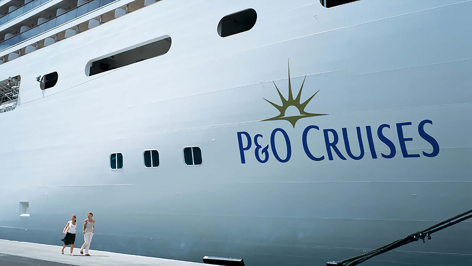
The well-known cruise line wanted to attract a younger audience as well as retain its existing, older clientele, as they introduced new ships to the fleet. The challenge: make the brand more appealing to a wider audience and more robust across digital platforms and TVC communications. The answer: the sunrise logo was redesigned, replacing the old outlined mark, whilst still retaining the company's heritage. A fresh palette and abstract wave pattern were introduced to add vibrancy, and a considered approach to typography gave the brand more sophistication. Following the rebrand P&O Cruises were set for their onward voyage, and the brand was aligned to the company’s ambition to broaden their market and fleet.
Creative Direction—Joseph Mitchell
Designer Director—Tony de Ste Croix
Designer—David Marshall