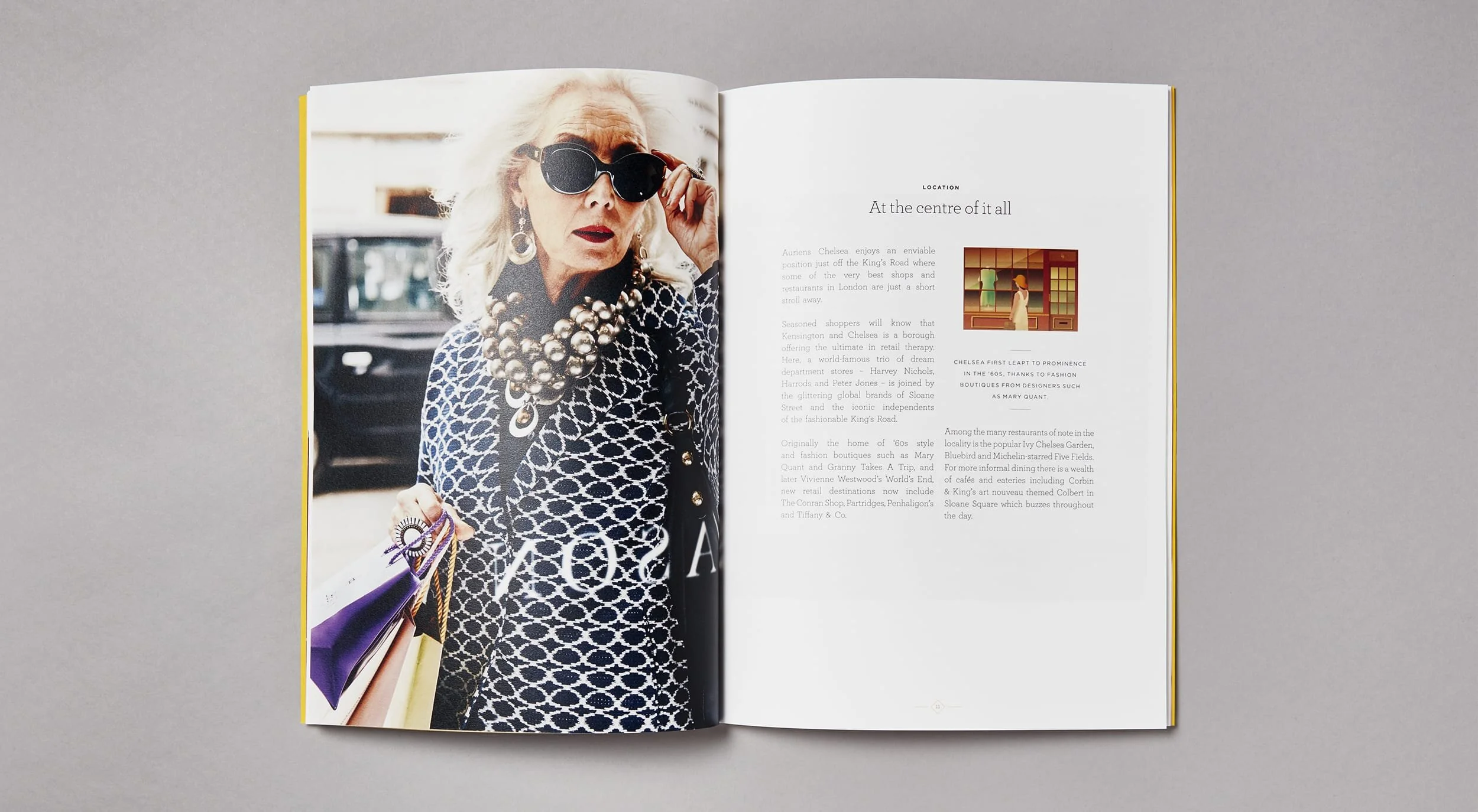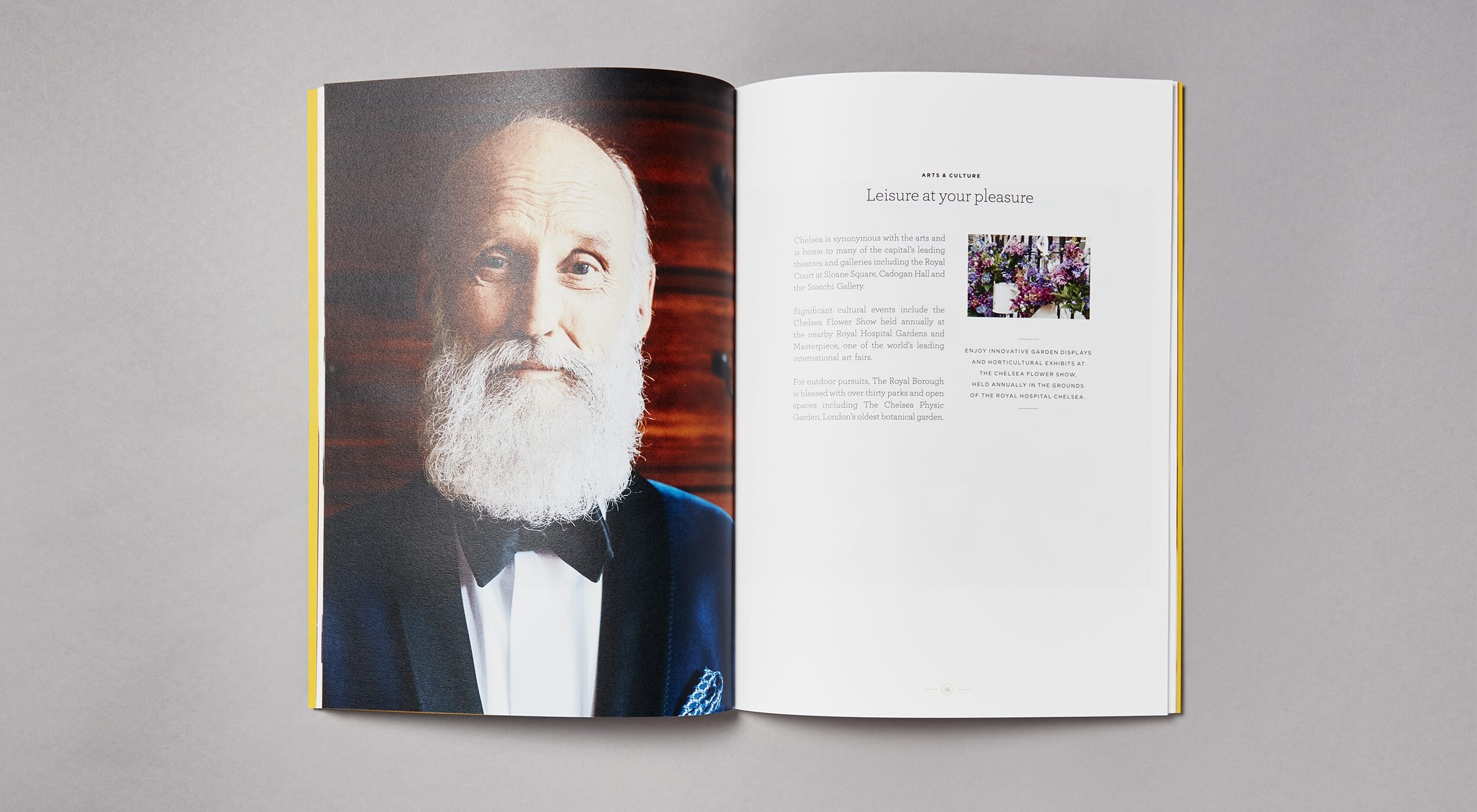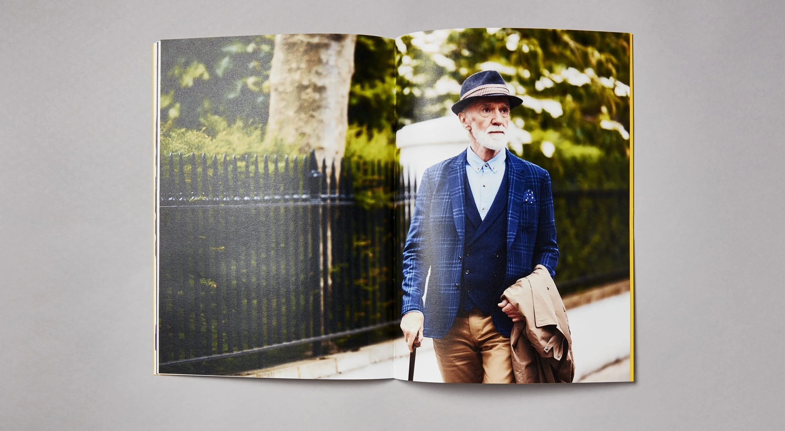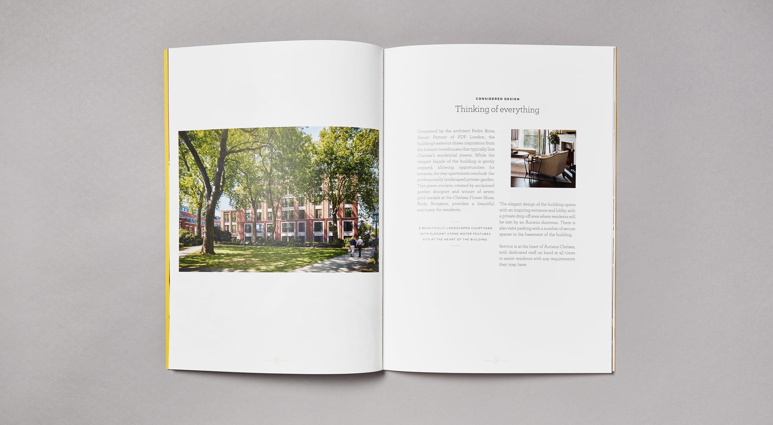
Auriens
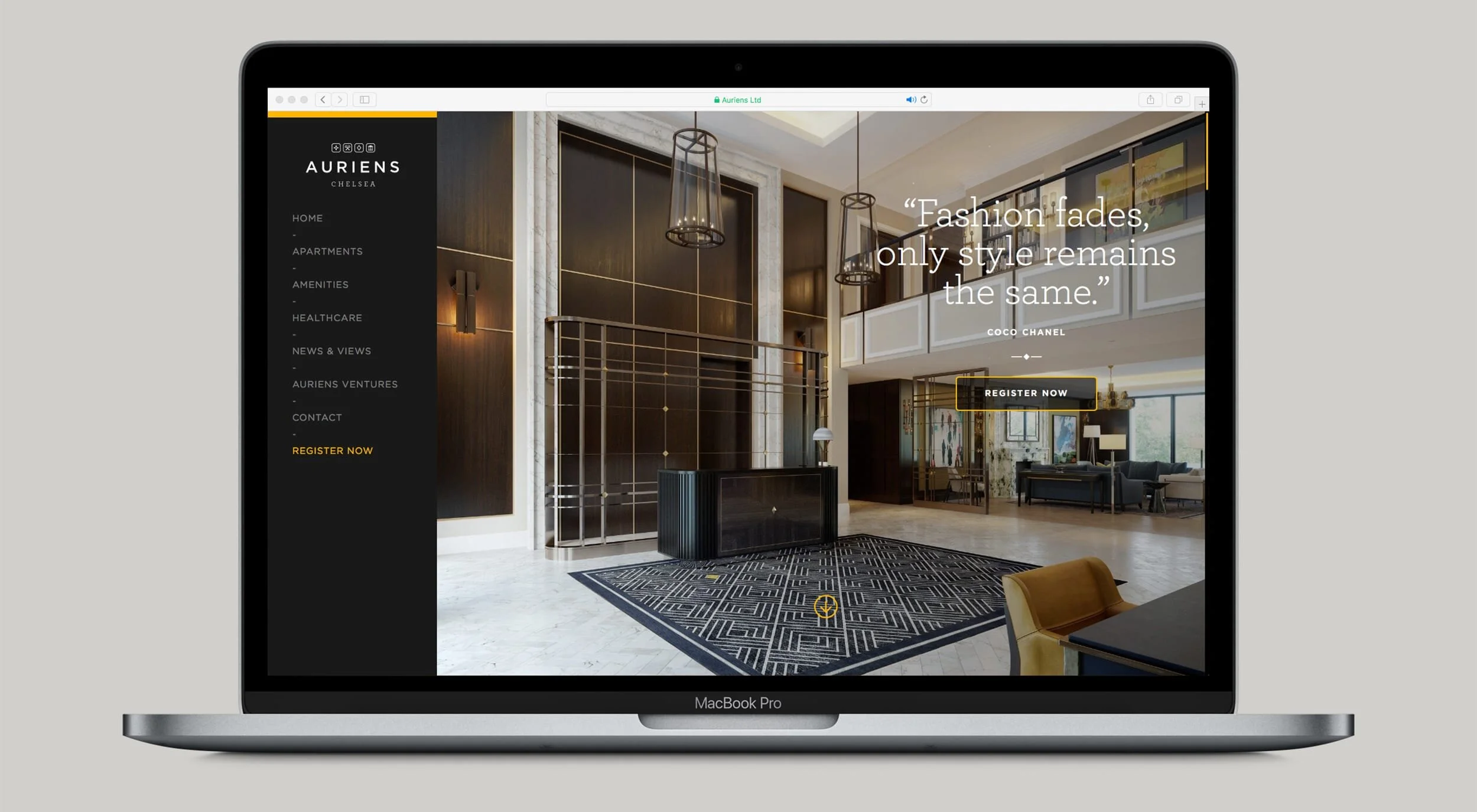
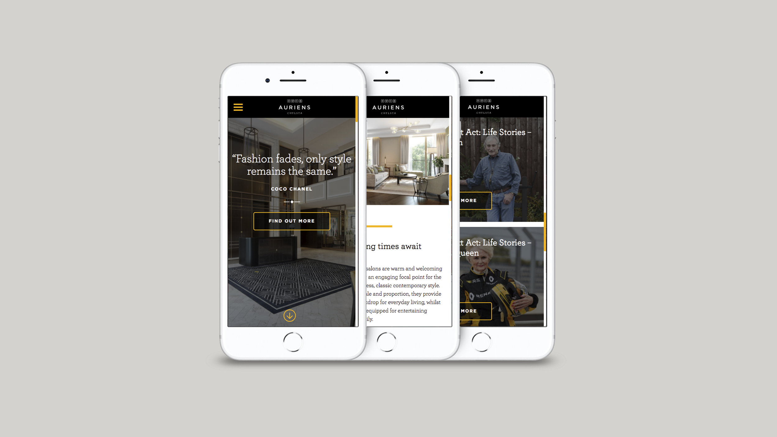
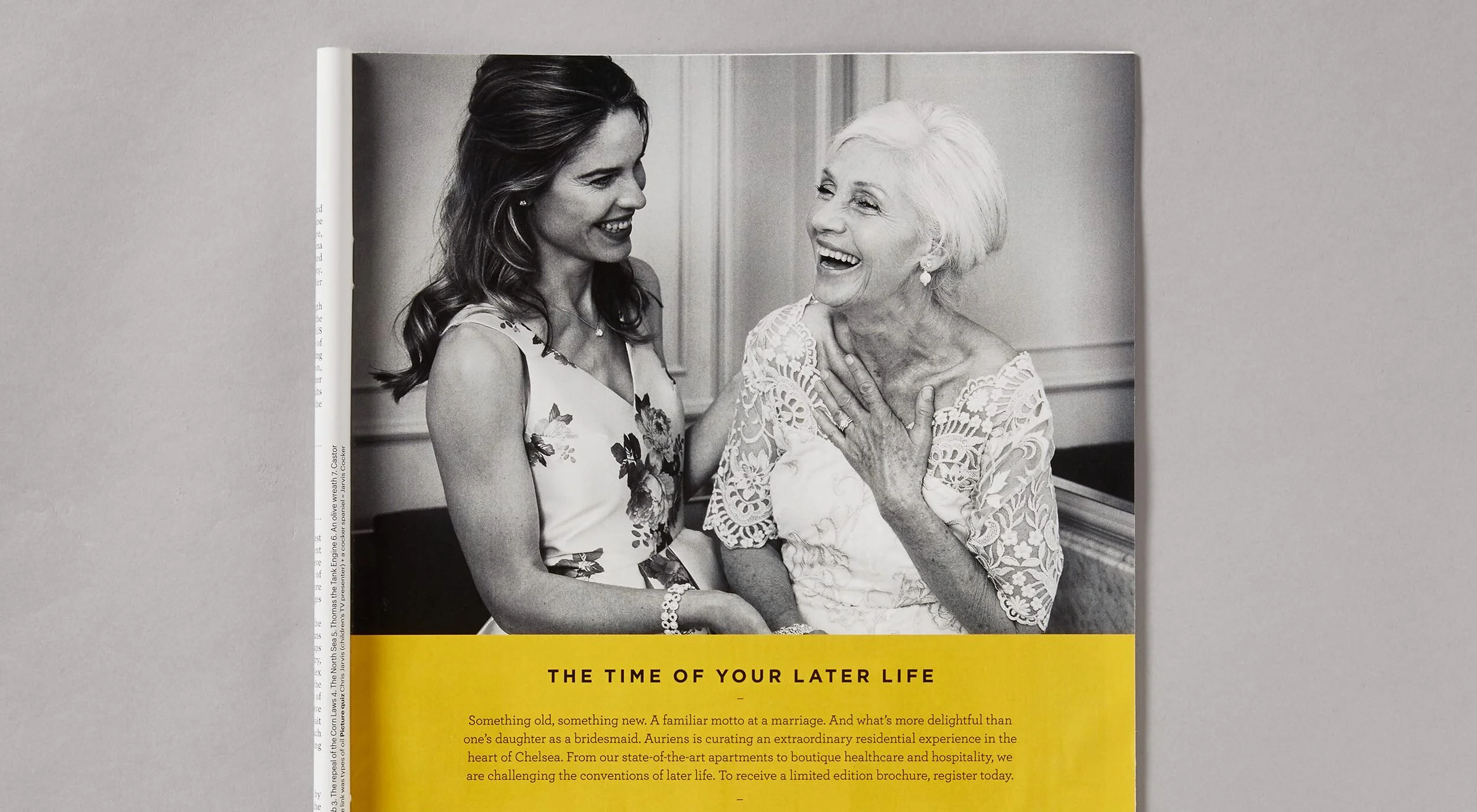
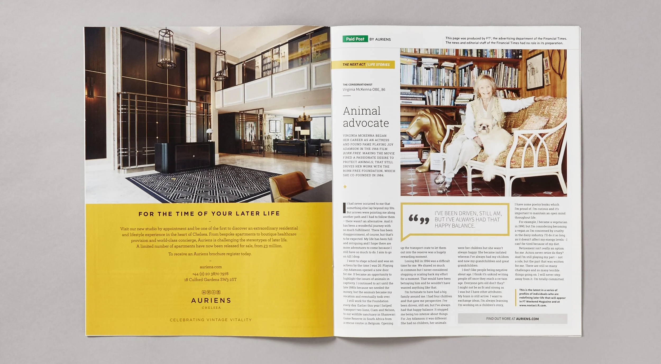
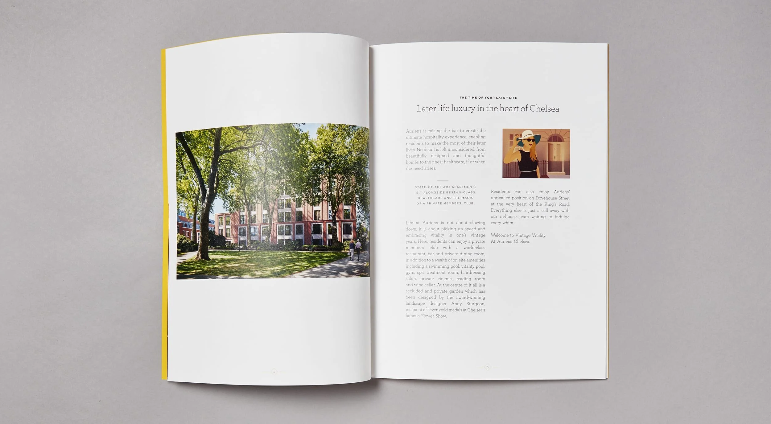
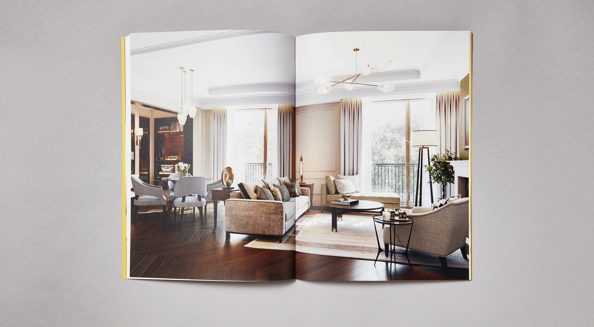
Auriens is a home for people in later life — the coolest Old Folks’ home. Based off the Kings Road, it is a development like no other, with every amenity you could wish for and luxury apartments that can be tailored to any later life need.
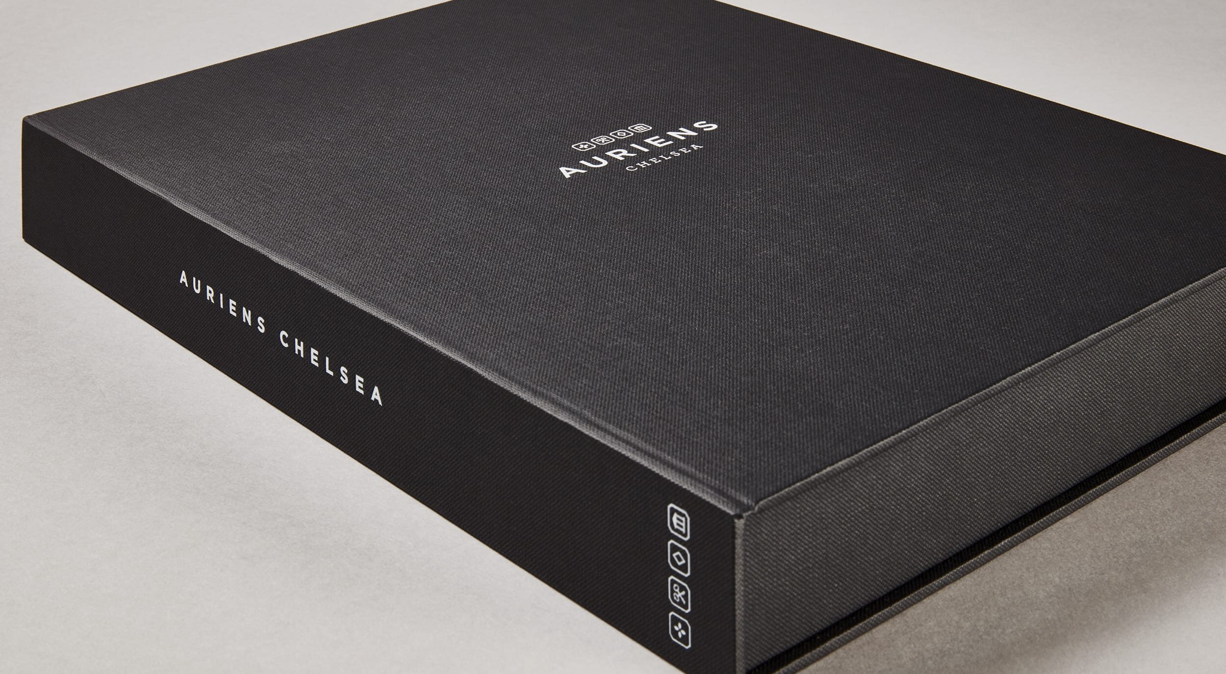
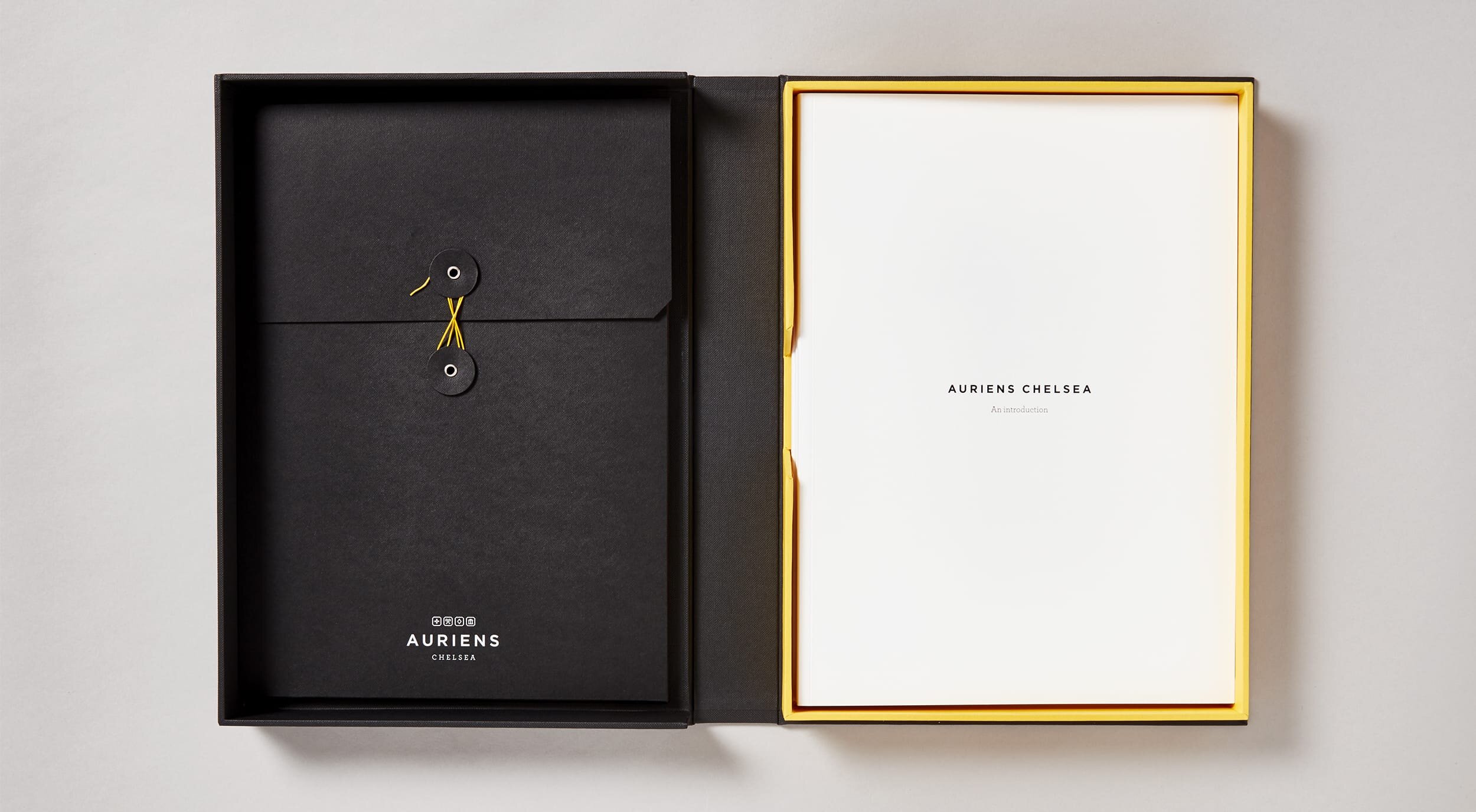
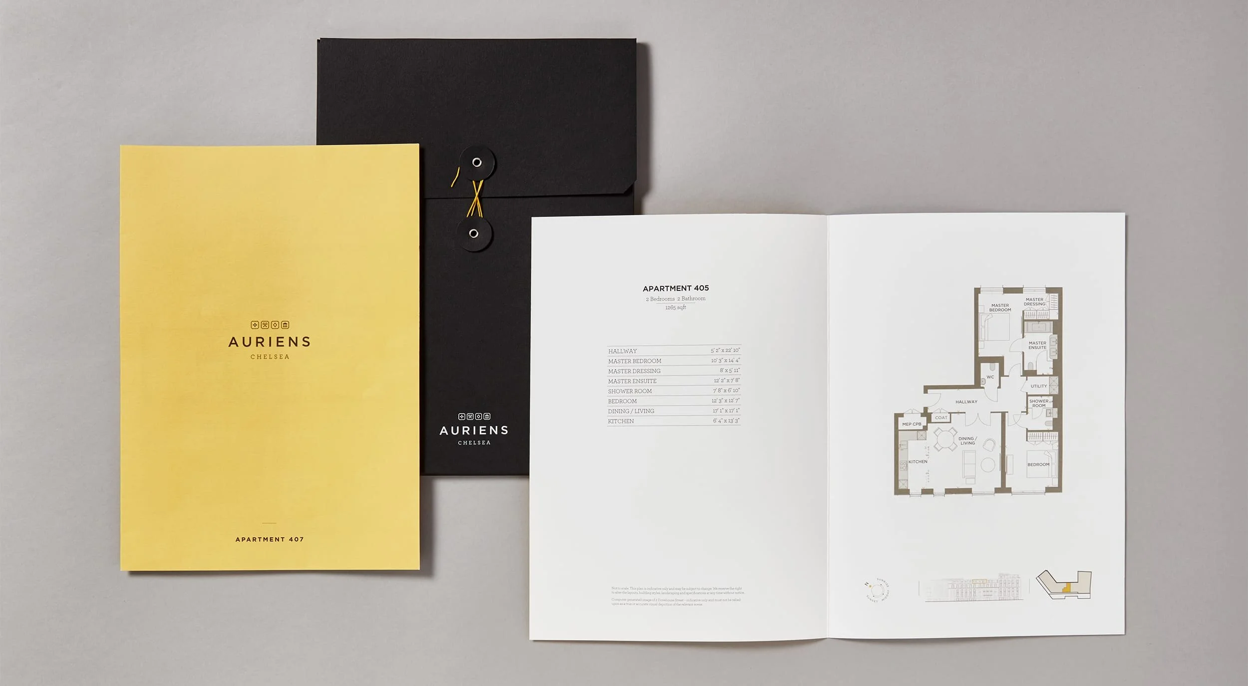
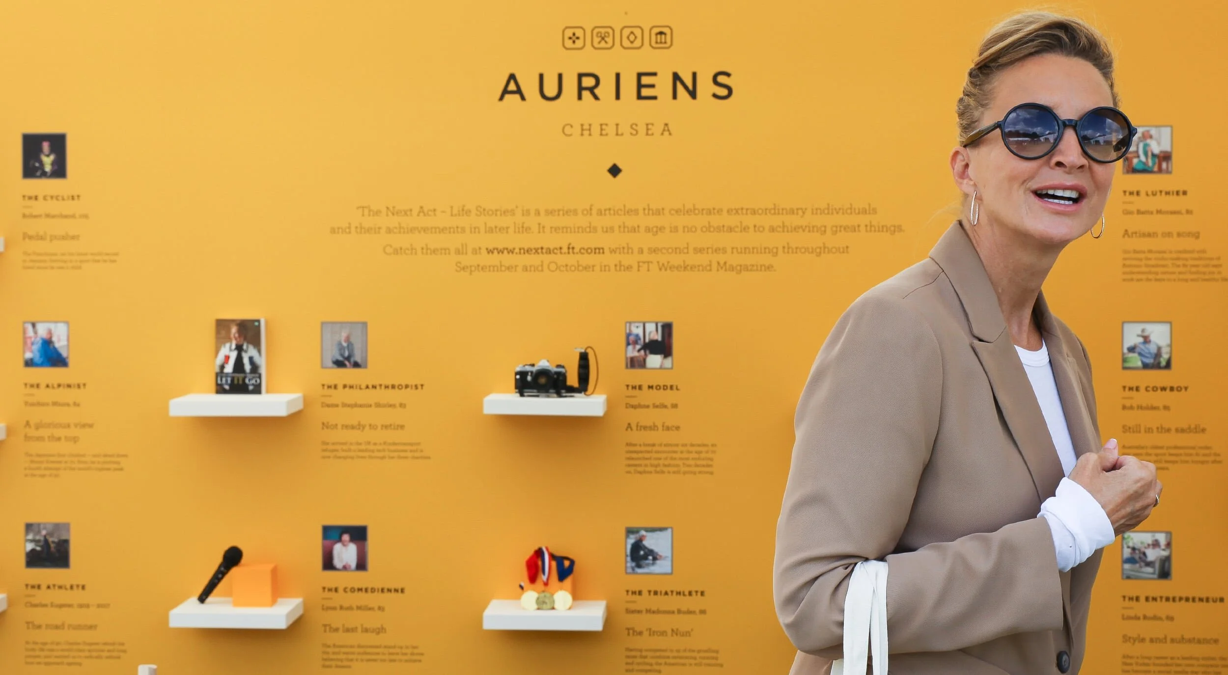
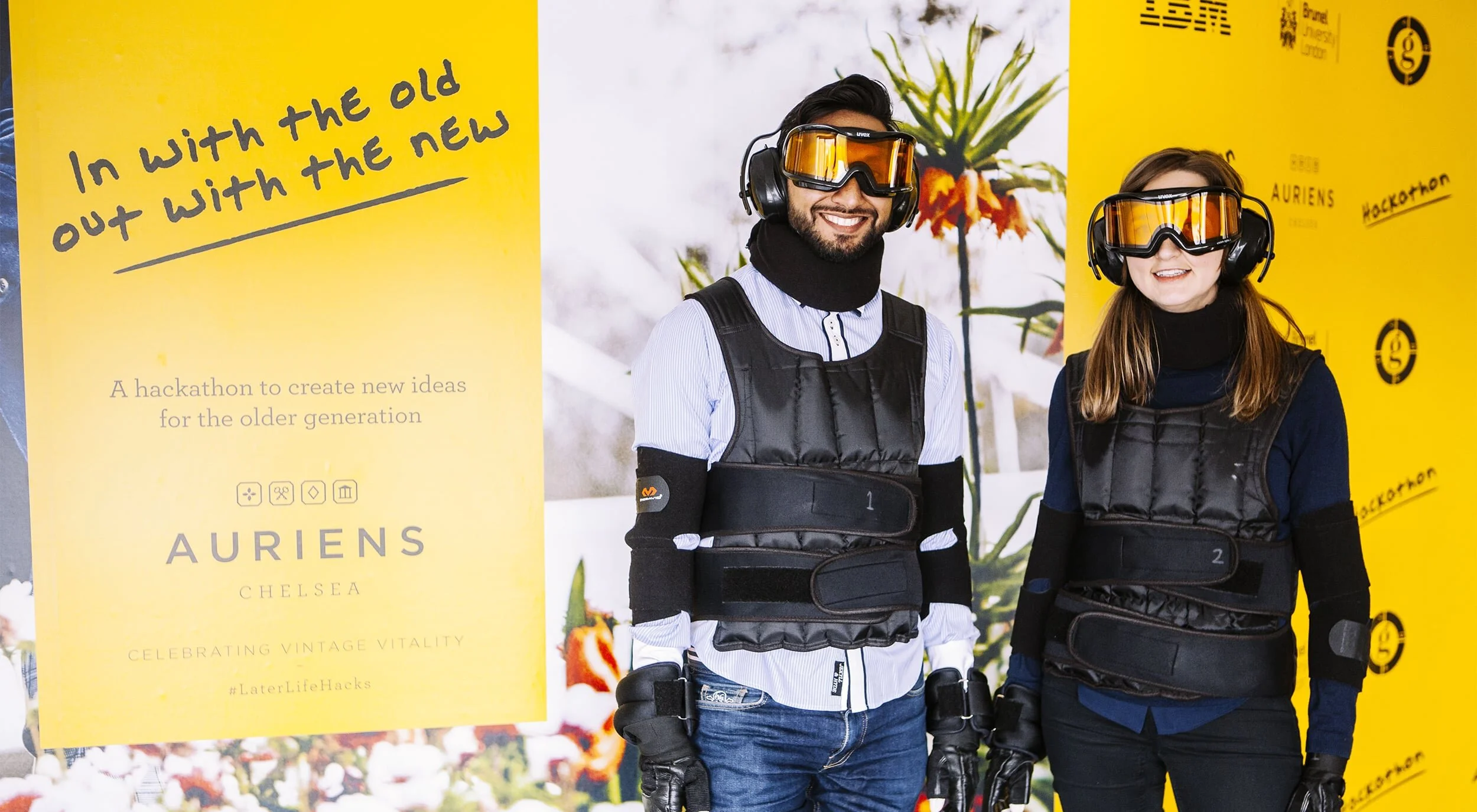
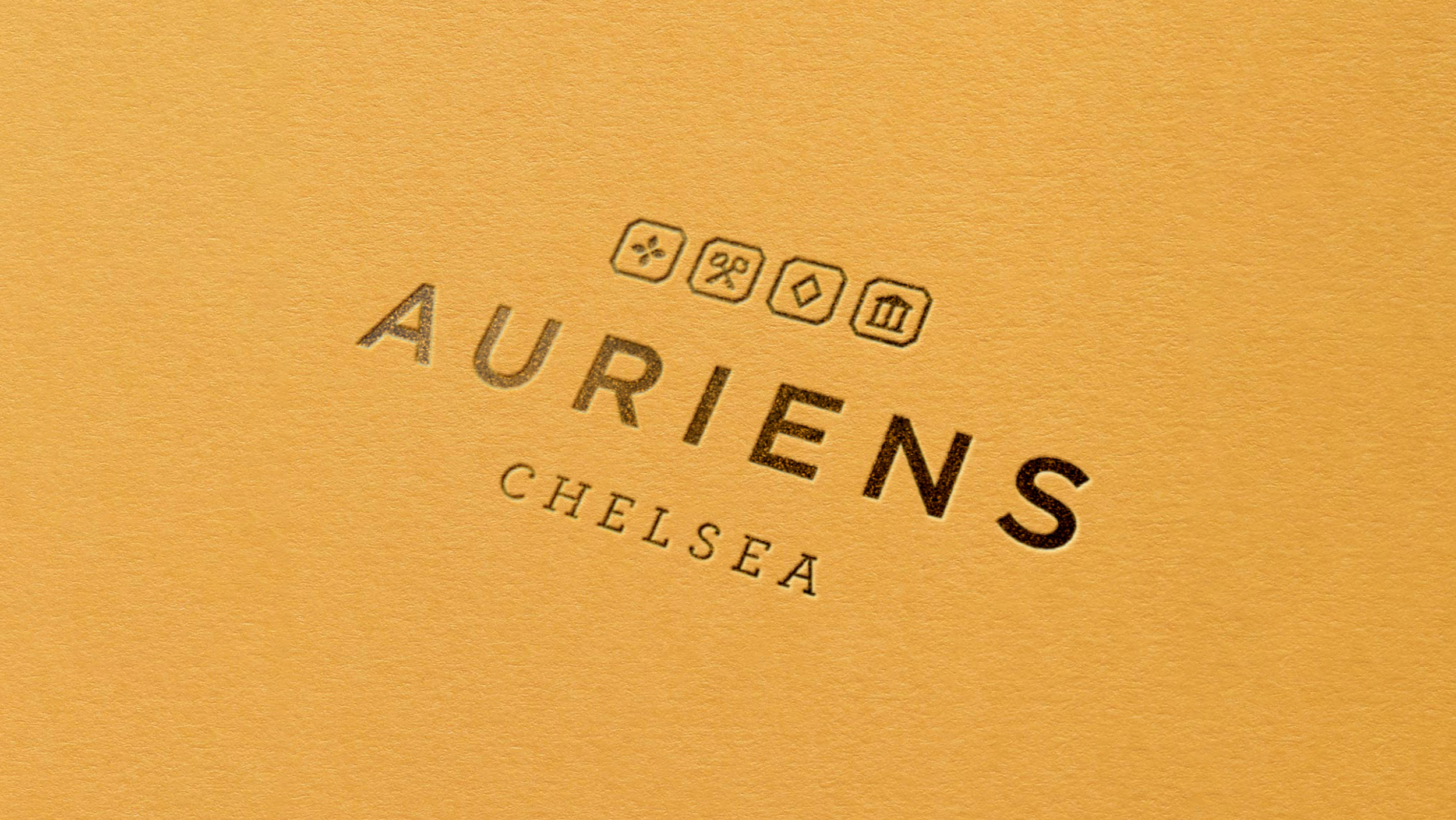
The visual identity for this development needed to sit effortlessly in the luxury market and have a vitality and spirit that represented the Auriens brand. The name, having come from the chemical symbol for gold, inspired a logo hallmark, a visual representation of authenticity and quality. The colour palette, with its bright yellow core colour, helped inject the required energy and an elegant typographic treatment provided balance. These three visual elements became a distinctive identifier across all communications and events, allowing us to move from high end print to tech hackathons with consistency and ease.
Creative Direction—Tony de Ste Croix
Designer—Damian Miranda
Designer—Mel Bartheidel
Agency—Heavenly